Chicago Film Festival
Scope May 2022 - July 2022
Roles Visual Design | Wireframing | Prototyping | Usability Testing | User Research
Tools Adobe XD | Adobe Suite | Google Suite
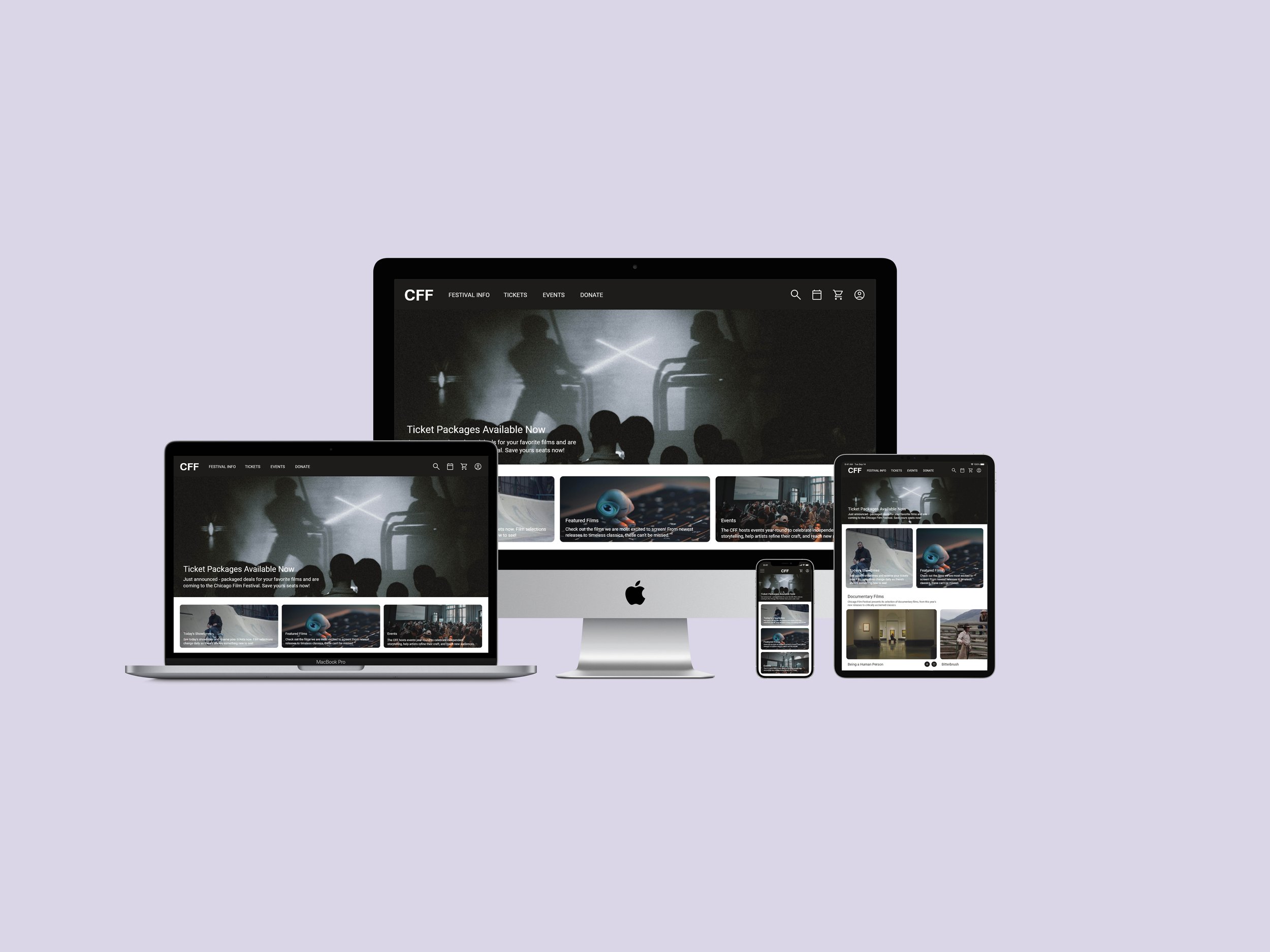
The Chicago International Film Festival is a year-round cinematic organization whose festival is held every autumn. The longest running competitive film festival in North America, it has a legacy to be celebrated and venerated. Currently, their online platforms do not reflect the progressive qualities the organization possesses through its dissemination of innovative and experimental film, and so for this case study I explored and executed how their website could be improved for a range of devices.
To solve this problem, over four weeks a responsive website was designed for desktop, mobile, and tablet devices that helps users, like film-goers, sponsors, directors, etc. utilize the website for their variety of needs and priorities. With the majority of users being festival patrons, the primary focus when building the website was to optimize their experience in planning their film viewings.
How do we create an experience that can be expeditious yet encourages exploration and continued engagement?
Discover.
User Interviews | Personas | User Mapping | Competitive Analysis
Beginning this journey and being an enjoyer of film, I had an idea of how a film festival website may be set up. Supplementing my personal experience, I have a good amount of acquaintances who have worked at film festival organizations, work in the film industry, or are film festival goers. Having the opportunity to interview these connections and hear their insights shaped how I approached this project and what I prioritized during design development.
From these interviews, pain points and motivations were identified; personas were developed to epitomize these findings, user journeys were explored to map out a typical scheduling process, and a competitive analysis was conducted. These tools were used to create a foundation that would inform the next steps and be used as a reference throughout the entire design process.
User Interviews
To understand the motivations of target users, user interviews were conducted to gain perspectives on existing systems and priorities. From these interviews, common pain points were identified and opportunities for intervention were made apparent.
“During booking season the greatest issue our clients have is buying their ticket packages. Leading up to the festival most of the calls I receive are in regards to bookings.”
“Some festivals make the submission process pretty tedious or its very unclear how to submit at all.”
“Once I know what film I want to see the transaction should be a quick and easy process.”
Personas
Based on user interviews and identified painpoints, personas were created that represent a festival patron and a filmmaker. I used these as reference while creating wireframes and mid-fidelity mockups to ensure designs are focused on the user.
User Mapping
Understanding the journey was key to developing an optimized user experience for festival goers. Initial user mapping focused on a festival patron and their process of securing film tickets within an optimized system. In contrast to the current navigation and user journey, this user mapping served as a blueprint for how the flow of the redeveloped site should function.
When developing this user journey, it was also understood that users utilizing this website could be those with limited technological experience. Creating a site that would accommodate varying levels of capabilities was key in to making it functional and user-friendly.
Competitive Analysis
Beyond assessing the existing festival site, a competitive analysis was conducted to understand how other film festivals accommodate users and what additional services they offer through their platforms. The analysis focused on the strengths and weaknesses (navigation, flow, branding, informational legibility, etc.) of festivals similar or larger in scale. The findings from the analysis informed how the Chicago Film Festival could position itself alongside its competitors and make improvements to increase patronage.
Define.
User Flows | Information Architecture | Wireframes | Low-Fidelity Prototype
After understanding who the users were, their pain points, and how the system could be optimized, possible interventions were explored. To begin hypothesizing what this product may look like, I began by developing a user flow to explore how a primary task could be completed. In order to determine how information would be organized across the site I developed information architecture as a blueprint for system structuring. Once I understand how users may navigate the product and its information architecture, I was ready to begin wireframing and testing with lo-fi prototypes.
User Flows.
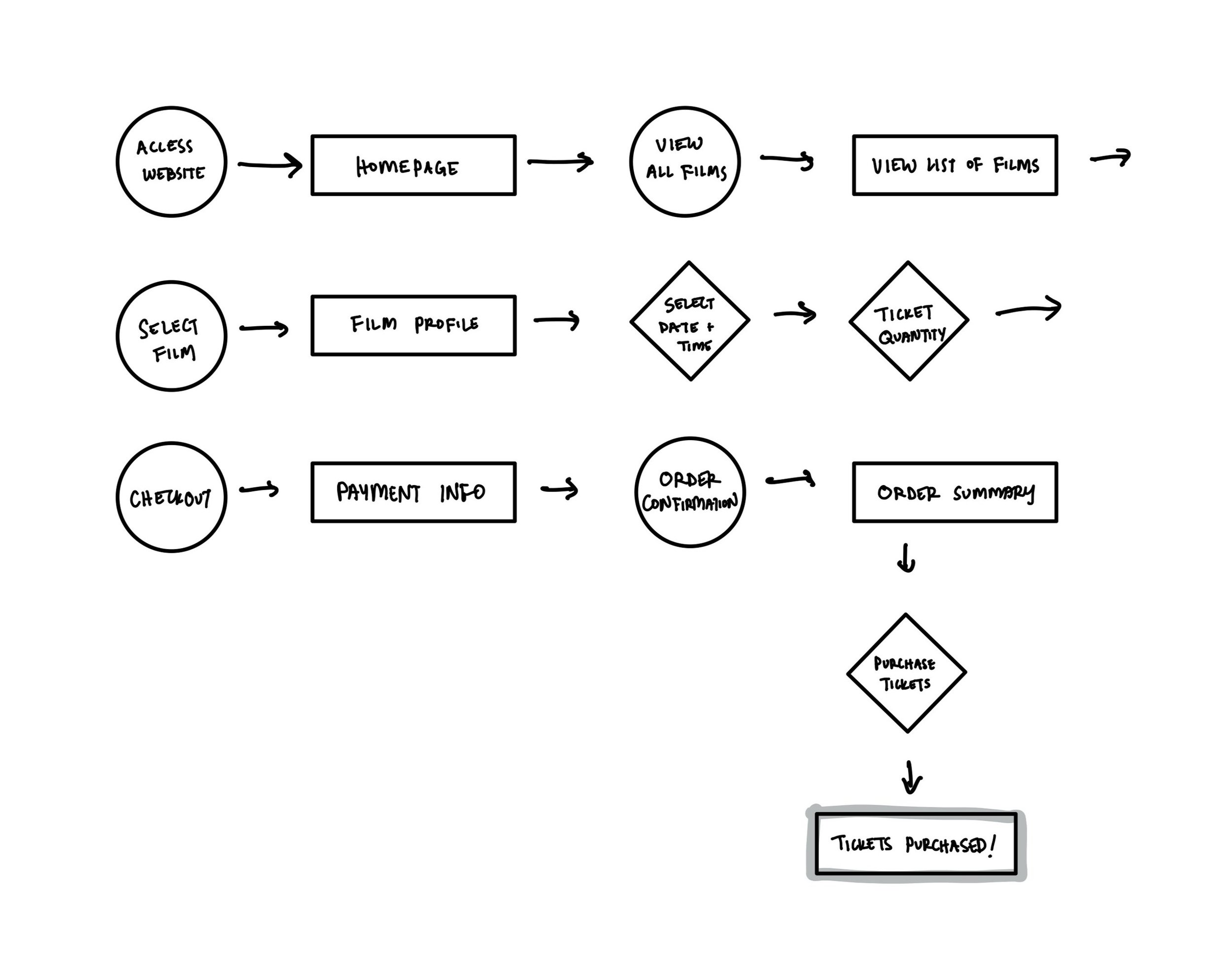
This user flow outlines how a user would arrive to the website, select a film, and purchase tickets for that film. This user flow would be considered as a blueprint for other tasks/flows across the site.
Information Architecture.
Information Architecture was designed to better understand how information would be organized in the application and to explore the technicalities of how the platform would function.
Wireframes.
Wireframes were developed through quick sketches to translate user flows to actual screens and to test the functionality of navigation and procession.
Low-Fidelity Prototype.
Once wireframe sketches were developed and tested, the sketches were translated to digital wireframes and the user flow was simulated through a low-fidelity prototype. This prototype was then tested among users so that errors in navigation or functionality could be identified before refining these into high-fidelity mock-ups.
Develop.
High-Fidelity Protoype | Case Study
Once the site’s structure was updated based on findings from initial usability testing, I transitioned to focusing on the UI and branding through developing a high-fidelity prototype. This hi-fi prototype was tested to confirm usability and optimized functionality, and once tested a case study was developed to summarize findings and identify next priority actions.
High-Fidelity Prototype.
After refining the design, user interface was re-explored to ensure that the flow between screens was cohesive and logical. The prototype focuses on a flow for users arrive at the homepage, search and browse and featured films, select tickets for a film, and purchase these tickets.
Based on findings from the usability testing, features to expedite the transaction process for the website (such as being able to search for a film through the navigation bar, check out as a guest, etc.) were incorporated.
Test out the prototype yourself here.
Case Study.
Once the high-fidelity prototype was developed and tested among users, a case study of this site was completed. Summarizing the information above, this case study shared of the process and findings of the product and outlined the next steps in the iterative design process.
Takeaways
Impacts: Our target users relayed the site was visually engaging and encouraged exploration, but emphasized the need to navigate the site through multiple ways and to include features to expedite the transaction process.
Lessons Learned: Apps and websites should anticipate how users navigate/utilize the site at different speeds (browsing vs. intentional sequences) and that when possible, include features/tools that can quicken/alleviate pain points during the transaction process.
Next Steps
Conduct follow-up usability testing on the new website and update the prototype accordingly based on findings.
Consider possible new features or improvements to the site.
The entire case study for this project can be found here.


