Shifter.
Scheduling made easy.
Scope February 2022 - May 2022
Roles Visual Design | Wireframing | Prototyping | Usability Testing | User Research
Tools Figma | Google Suite | Adobe Suite
Shifter was developed to solve a problem: make scheduling a simple, less daunting, less time-consuming task. With small businesses that have ever-changing work schedules in mind, the goal of Shifter was to create a product accessible and useful to the non-tech savvy, the busy, and those on the go. Additionally, as user research progressed, the app developed into a database for small businesses to consolidate messaging, scheduling logistics, and other resources a businesses would need on a digital platform.
To solve this problem, a four-week app was developed that helps users, both managers and hourly employees, intuitively manage shifts and coordinate availability and workloads. Cutting out the frenetic noise and inefficient processes of an analog system of scheduling, Shifter translated the essential elements of organizing worker information in order to create a streamlined system.
How do we make creating a schedule and managing employee availability a streamlined and simple process?
Discover.
User Interviews | Personas | User Mapping | Competitive Analysis
Beginning this journey, I had an understanding of how many small businesses approach scheduling and managing employee shifts. To supplement my personal experience, I wanted to gain more understanding of others’ experiences, how scheduling processes worked across varying industries, and how other products may have already found solutions.
In order to understand workers (both managers and hourly employees) pain points and motivations, user interviews were conducted. From this, personas were developed to epitomize these findings, user journeys were explored to map out a typical scheduling process, and a competitive analysis was conducted. All these tools were used to create a foundation that would inform the next steps and be used as a reference throughout the entire design process.
User Interviews
To understand our target users, user interviews were conducted to gain perspectives on current systems of management, scheduling processes, and to identify inefficiencies. From these interviews with a range of users, common pain points were identified and opportunities for intervention were made apparent.
“It would be great if there was a way for me to release a shift for anyone to take rather than having to ask people individually to cover for me.”
“When my employees’ availability change they tell me directly and I have to update the system myself. It becomes a huge headache and I usually make an error when adjusting multiple schedules at a time.”
“Right now we have a human resources app and also a scheduling app - it would be great if the information could just live in one place.”
Personas
Based on user interviews and identified painpoints, personas were created that represent a manger and hourly employee. I used these as reference while creating wireframes and mid-fidelity mockups to ensure designs are focused on the user.
User Mapping
Understanding the journey was key to developing an optimized user experience for both managerial and hourly workers. Initial user mapping focused on shift managers who would be developing schedules for employees. With the analog system of schedule development in mind, an optimized user map was created to hypothesize how each step of the scheduling process could be enhanced with this product.
When developing this user journey, it was also understood that the user utilizing this product most significantly would also possibly be someone with limited technological experience. Creating a blueprint that would accommodate varying levels of expertise was critical in creating an application that could be used by many and functional for all.
Competitive Analysis
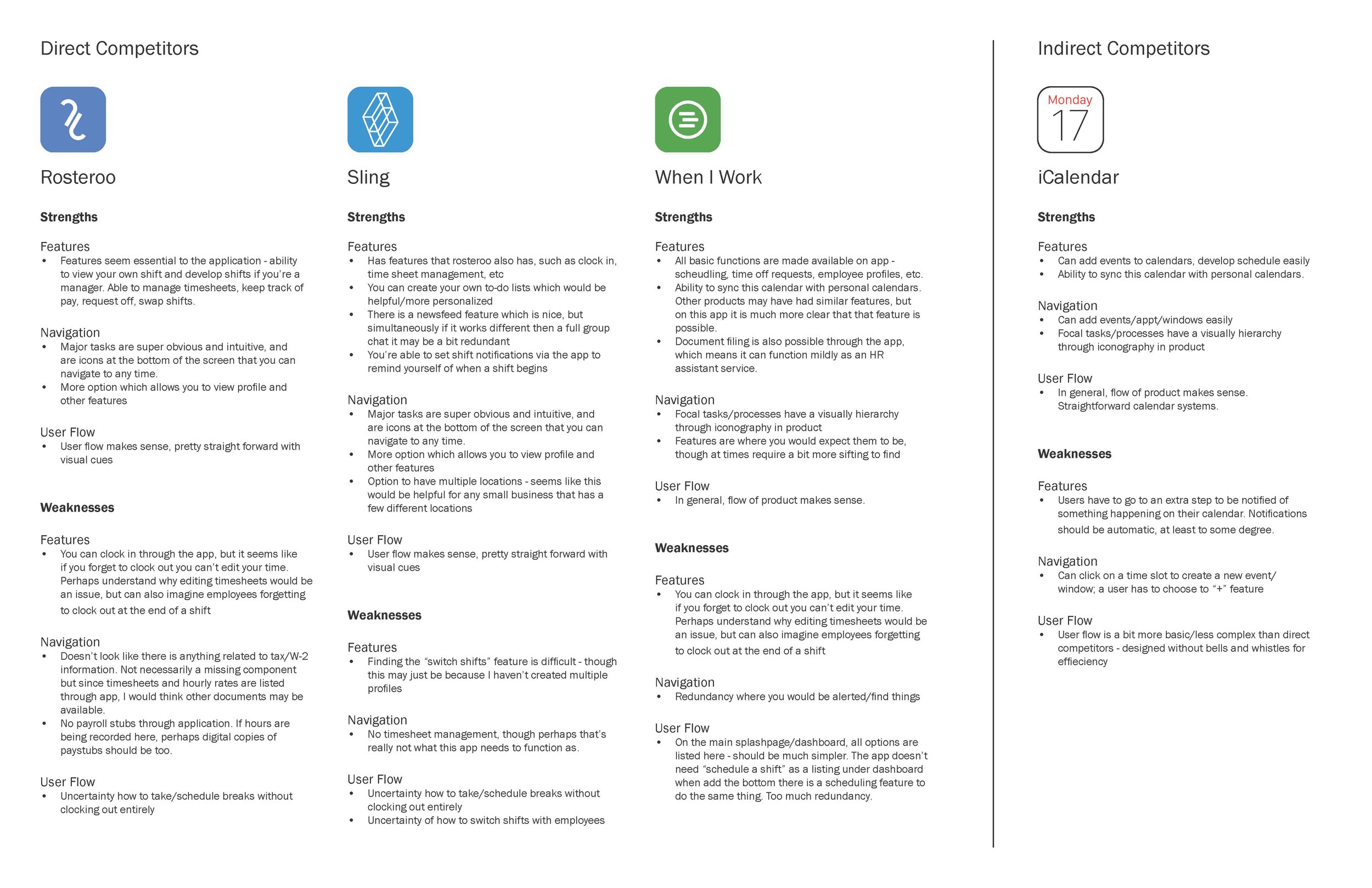
In order to understand which scheduling products were already available, and to identify how this product could address an unsolved problem or improve a current system, a competitive analysis was conducted. The analysis focused on the strengths and weaknesses of other scheduling or calendar products to understand how this product fits within the market.
Concentrating on product features, navigation, accessibility, user flow, and branding, the competitive analysis not only focused on what elements are being offered, but how user-friendly and intuitive these products are.
Define.
User Flows | Information Architecture | Wireframes | Low-Fidelity Prototype
After understanding who the users were, their pain points, and how the system could be optimized, possible solutions were explored. To begin hypothesizing what this product may look like, I began by developing a user flow to explore how a primary task could be completed.
Determining how information would be ordered in this product was necessary, and so information architecture was developed as a blueprint for system organization. Once I understand how users may navigate the product and its information architecture, I was ready to begin wireframing and testing via lo-fi prototypes.
User Flows.
This user flow outlines how a user would open the app, view their schedule, and develop a shift. This user flow would be considered as a blueprint for other tasks/flows across the product.
Information Architecture.
Information Architecture was designed to better understand how information would be organized in the application and to explore the technicalities of how the platform would function.
Wireframes.
Wireframes were developed through quick sketches to translate user flows to actual screens and to test the functionality of navigation and procession.
Low-Fidelity Prototype.
Once wireframe sketches were developed and tested, the sketches were translated to digital wireframes and the user flow was simulated through a low-fidelity prototype. This prototype was then tested among users so that errors in navigation or functionality could be identified before refining these into high-fidelity mock-ups.
Develop.
Sticker Sheet | High-Fidelity Protoype | Case Study
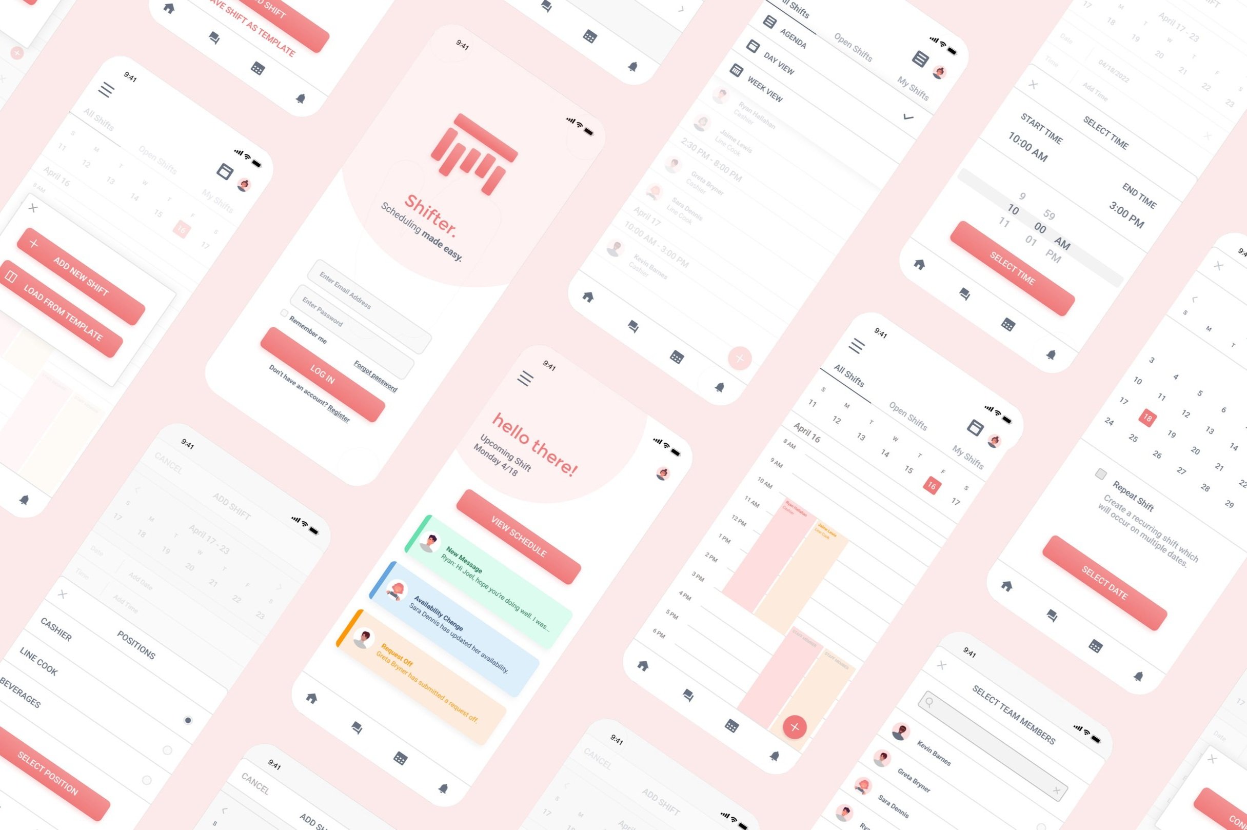
Once the app's framework was developed to a functional yet flexible point, and ensuring the product’s features met the core objectives, I transitioned to focusing on the UI and the branding of Shifter. I developed a sticker sheet that could be used as a reference and resource when solidifying the application’s design. Once the app’s branding was developed, Shifter was tested as a high-fidelity prototype to confirm usability and optimized functionality.
Sticker Sheet
For this product I wanted a color palette that was clean and inviting. I also wanted to use typography that was easy to read and consistent. Iconography was based on common symbols that users would recognize, rather than customizing to (confusingly) align with branding, as seen with other competitor applications.
High-Fidelity Prototype.
After refining the design, user interface was re-explored to ensure that the flow between screens was cohesive and logical. The prototype focuses on a flow for users to log in, view their schedule, to develop a shift including all necessary elements (date, time, location, worker), and post the shift. Through the app, workers would also be able to change availability, request time off, and message other employees.
Test out the prototype yourself here.
Case Study.
Once the high-fidelity prototype was developed and tested among users, a case study of this application was completed. Summarizing the information above, this case study shared of the process and findings of the product and outlined the next steps in the iterative design process.
Takeaways
Impact: Shifter is a product that makes the laborious task of scheduling shifts easy. Intuitive and easy design allows for high efficiency.
What I learned: Creating an easy-to-use product for something that requires input of information from the user can easily become complicated. Conducting usability studies and receiving feedback continuously throughout the design process allowed for us to understand how to best refine the product.
Next Steps
Develop additional components to the product that may be helpful for users.
Conduct additional usability studies for these new components to confirm functionality and product consistency.
The entire case study for this project can be found here.


